Welcome to the first in a series of 'Eavy Metal style articles by miniature painter extraordinaire
Andy Craig. Those of you who frequent the Facebook Oldhammer
Community may well have already had the opportunity to pick Andy's brains over different aspects of miniature painting. Many of the paints discussed here are available from arts suppliers, such as The Range or Hobbycraft, though we do refer to quite a few old school Citadel Colours, so you may wish to refresh your memory with this
article first.
A few posts back I talked about my view of miniature painting and how 'technique can never be a replacement for soul'. As many of you have said, it seems that the 'winning is everything' ethos that prevails among many players of GW games has seeped into the painting scene too. Whatever happened to the sense of adventure and fun that existed during the early years of the Golden Demon competition, eh? Have a look
here,
here and
here if you are unsure what I mean by this.
The theme for this edition of Realm of Chaos Black (get it?) is the colour recipe. Now I am a simplistic out of the pot man, largely because I have never really felt confident enough to go crazy and start mixing up colours, largely due to the fact that my usual result is a rather muddy finish. Well Andy has been really helpful in offering quite a bit of advice in this regard that should interest those of you who wish to improve your painting. So I'll hand over to him...
Enjoy!
Orlygg.
Red for the Red God!
In my early career, reds were a very difficult colour to get right and I'd avoid using it like the plague. Upon arrival at the 'Eavy Metal studio, I soon found out from the other figure painters that I wasn't alone.
We'll start with the red on the cape in the image below.
First of all make sure your using a good red, e.g. a red that has a very Matt finish - 'cheaper' brands are better for this. I use Anita's acrylic which can be bought in most hobby stores/art suppliers. It really is wonderful stuff, I've used it for years.
For a velvety cloth look, as in the image below, mix red, dark brown and black. Half the amount of black to the red and brown. Thiswill provide you with the base colour. Then start to apply red mixed with small amounts of the base until you are using only red for the first stage of highlights. The red should be pretty prominent by now, so begin to add small amounts of orange to the stand alone red, keep the highlights small to retain the red as larger highlights will just bleach the red. Add a bit of white to the orange and red for the finishing highlights but don't go anywhere near white! I'd say half a tone higher as by this stage the highlights should be very small.
I hope that this makes sense and you can get good results from the mix.
Bright red.
To achieve a brighter red, I mix any base red with Dealer Rowney 'FW' series acrylic ink, expensive stuff but my God guys this stuff rocks! The reason I add ink to the red is the richness it creates and this technique works the same for any other corresponding colour. So, base colour applied(may take two or three coats to get a flat, even base) just add yellow to the base mix again keeping the highlights small (really important) until you are using yellow, no white.
Weathered red.
Mix red, purple and half the amount of black. The purple will give the red depth. start highlights by adding red to this base mix until you are using using red alone. Highlight using red and orange unitl half the tone of the red, then apply a thin ink wash of dark brown (raw umber is a good choice) red and again half the amount of black just to tone things down.
Blood red.
This is really simple. Just use black, red and dark blue for your base colour, then half the amount of red to black and blue. Add red to base mix until you using just red to highlight. Once this is dry, use a brighter (not a mix) stock red like if you were using a crimson red to mix the base colour.
 |
| Chaos Warrior Bloodbowl Style! Painted by Andy and part of Bryan Ansell's collection. |
Yellows and pinks.
Okay, I've lost count of the times that I've been asked 'how do you get such bright yellows and pinks'. It seemed to be a trademark as to how people back in the '80s recognised my work, so here goes....
Yellow
Use a mid tone yellow, such as the old Sunburst Yellow, and there are a couple of ways you could apply this to your model.
1, mix yellow paint and orange ink, one quarter ink to paint, apply as your base, then add yellow to this for highlights until you're using only yellow. Add white to yellow again keeping highlights small, (as long as you can see at least three tones...your doing good) until you are using an almost white.
2. Base coat using just the yellow on its own, again mix yellow and orange ink as before, then apply it as a wash, go for the consistency of milk for your colour wash, you should need only one wash for this. The start your highlights using yellow alone, then add white as desired.
Off yellow.
For a more realistic looking yellow I use Windsor & Newton 'Nut brown', any tone of yellow works for this. apply the same way as above 1 or 2. good idea to experiment with this using different shades of brown, also really good for painting Gold rather than using gold, seen so many painters using this (not my theory, but from what I,ve seen, the same type of thing) to paint gold and it looks awesome. also works well for that battle worn yellow look, just add more brown ink or give a light (watered down) brown wash.
Pink.
Its been years since I've painted anything pink and the only way I achieved this was using Citadel Titillating Pink. Base coat your model with this pink, then mix the pink and half the amount of a bright red ink. Then mix this down to an ink form before washing over the pink. Highlight with Titillating Pink, then pink and white.
 |
| One of the greatest colours (along with Bilious Green) to be found in the original Citadel Paint Sets. Now very hard to get of as the Coat d'Arms version, called Shocking Pink, is a different colour. |
 |
| Here's an example of Titillating Pink in action. A two-tone Tzeentch horror by Andy. Now in the collection of Bryan Ansell. |
Flesh tones.
One thing I've loved doing above all others, is experimenting with colours, and none is more relevant than different skin tone effects. I've been using this recipe for flesh for most of my career, so I hope it is of some use to you guys.
With so many paint manufacturers out there selling their 5 or 6 step flesh tones, save yourselves some money guys and just buy the darkest tone.....and add white to it..
If you want to create your own, use this as your base colour. Mix red, yellow, white, brown (burnt umber) and Windsor & Newton 'Burnt Sienna' (must be w&n Burnt Sienna for this to work). Mix brown, white in the same amounts, then add red and yellow at half the amount, then Burnt Sienna ink as same amount as yellow and red. experiment with this to obtain different skin tones, add more red for a more tanned look or yellow for a more bronzed look. For me, its been a great foundation skin tone, if I feel the base mix is to dark for a particular figure I just add white.
It would be great hear how you get along with this.
 |
| Another two tone horror, again part of Bryan's collection and painted by Andy. |
Greens.
I loved painting orks when I was working in the studio, so to start I'll explain the green I used for greenskins.
Any mid earth tone green (such as the old Woodland Green) will do as a base. Use sunburst yellow, white and Windsor & Newton 'apple green' ink, mix the green with half amounts of white and yellow, though you may want to add less white if you like the darker tones. Add a quarter of ink to this then use as base coat. Add white and yellow to base colour for highlights, then give a thin wash of apple green ink once highlights are completed.
Weathered greens
These work well for clothing and look great light or dark. Mix dark brown (raw umber) Woodland Green and black. Use the same amounts of brown and green and a quarter black, then use as base coat. Add Woodland Green to the base mix for highlights then add yellow to woodland green for your final highlighting but stop just as you see the yellow starting to show. Make a thin wash from the base mix then apply as a finishing touch.
 |
| Bloodbowl Star Player. Painted by Andy. Owned by Bryan. Photographed by Steve Casey ! |
Blue.
System 3 Process Cyan by Rowney is the only blue I've used for years and you can achieve some incredible shades just by adding to it. If you want a deep rich shade add a dark purple ink, which seems to work better than just adding paint. Windsor & Newton Ultramarine ink works really well with this blue and gives an incredible mid tone.
Metal
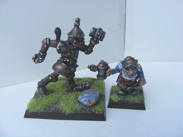
I've seen some amazing metal effects on armour over the years, but let's face it, metallic pigment has never really been that good, which is why you see so many painters going for the option of painting the illusion of metal these days. I'll start by taking you through the rusty looking metal on the image below.
Rust.
For this, you'll need gold, black ink and orange ink. Base coat with gold and make sure it's bone dry or the gold will shift. Mix the same amounts of black and orange ink and half the amount of gold paint. Water this down and apply, but before each application give the mix a good stir. You could even use this mix to target certain areas of metal to give them that starting to rust look. I used this mix many years ago to paint some chaos knights for a friend (around 25 figures) as he wanted them quickly, so I applied this mix straight onto the bare metal using the same colours, but this time I used enamels thinned with white spirit, they looked great!
Gold.
Base coat with your gold, again making sure that its dry. Then mix yellow ink, a mid tone brown ink and just drop of gold paint. The gold paint will now take the 'shine' off the ink. Oh, before I forget, anyone that has a problem with ink shine add a Matt medium to the ink before hand, Dealer Rowney do a good one. Highlight with gold paint then add silver for the final highlights.
There are a number of ways to shade, highlight and colour wash with these two colours. There are many shades of black on the market and many tinted whites, again... don't waste your money when you probably have these colours already. Just follow these simple steps if you're having difficulty or just fancy a new method.
The first, and most simple method to make your blacks look interesting, is use the dark tones of blue, green or red. This will depend on the figure type, so for instance let's say a LOTR wraith, I'd paint a base coat of black, then for the highlights, mix black with a mid tone blue, now, the trick here is to keep your highlights very small, best not tone all the way up to a light blue, just the blue alone should be enough. If there's three quarter's black still showing your on the right track. Emphasise all the high ridge folds on the wraith's cloak remembering to keep the highlights very small. applying a very thin wash of a dark brown ink, as this just gives that extra bit of depth. Experiment with different colours on different models and see what you can achieve.
Again, depending on the figure type, let's say you wanted to paint the hair on a figure white, apply an ink wash of yellow and burnt sienna mix in equal amounts using the same amount of water (use a Pipette) then highlight using white. This makes for a more interesting tone of white.
Sky blue, light tan, and parchment work well also, as with black, make sure the white is dominant. And there is no harm in giving whites a full colour glaze orwash for an off or dirty looking white.
Cheers,
Andy Craig.
A big thanks to Andy for contributing his time to Realm of Chaos 80s once more. And I am please to announce that Mr Craig will be providing plenty more advice in future articles, including more advanced painting techniques and freehand shield and banner painting, so watch this space.
Feel free to comment about the techniques Andy has described, or email us any miniatures you've painted using his techniques. If you have any further questions, Andy can be contacted through me at this blog or directly on Facebook's Oldhammer Community.
Right, where's my Titillating Pink and those Tzeentch daemons?
Orlygg.


